

Logo formation process
Slogan, icons and color palette
The STEPS socks stand where I present - stickers, posters, packaging for socks, a shipping bag,
Website for ordering, socks with pockets inside which there are branded bags with small contents.


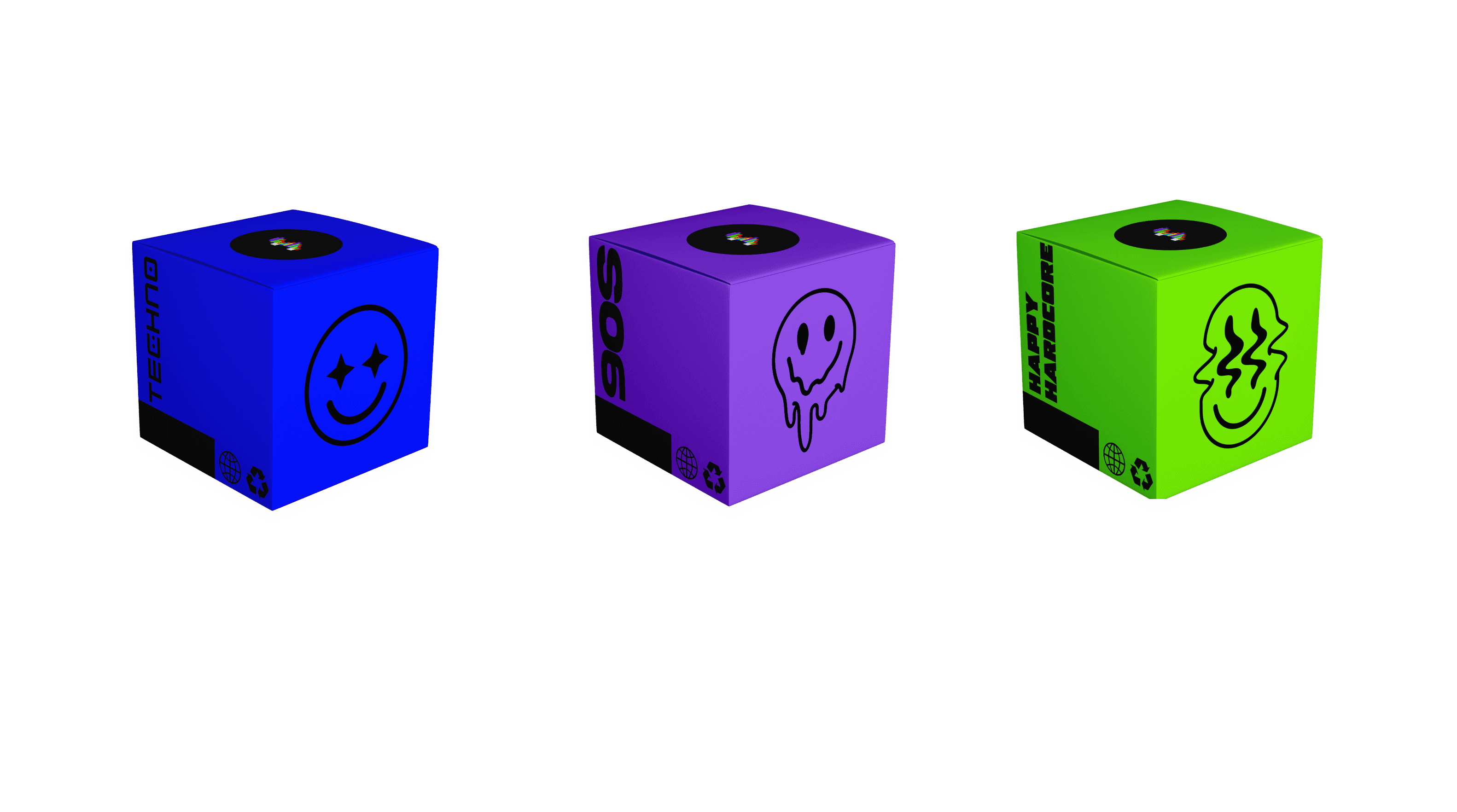
Packaging for socks and branding typography
posters

Story-telling
Graphic desgin
Branding
A project for a branding course in Shenkar | Third year
STEPS
Web Design
This project focuses on the branding and packaging design for a conceptual sock company inspired by rave culture and underground electronic music scenes. The brand is targeted toward audiences connected to acid house, happy hardcore, and techno communities where fashion, function, and self-expression intersect.
The product itself is designed specifically for rave environments: socks featuring discreet pockets that allow wearers to store small, practical items while dancing or attending parties. By combining functionality with bold visual identity, the project explores how everyday fashion items can be reimagined for subcultural lifestyles.
The design process was research-driven and exploratory. I began by studying the historical evolution of socks—both as a garment and as a cultural object and expanded the research into the origins of rave culture and underground movements. This contextual foundation informed the visual direction, helping define a design language rooted in rebellion, rhythm, and communal expression.
STEPS website
